Reinventing the tubemap
I think it’s safe to say that I never set out to redesign the London Underground map. The original design, conceived by Harry Beck in 1932, is a classic and one of the best pieces of graphic design of the 20th Century; I hold it in very high regard.
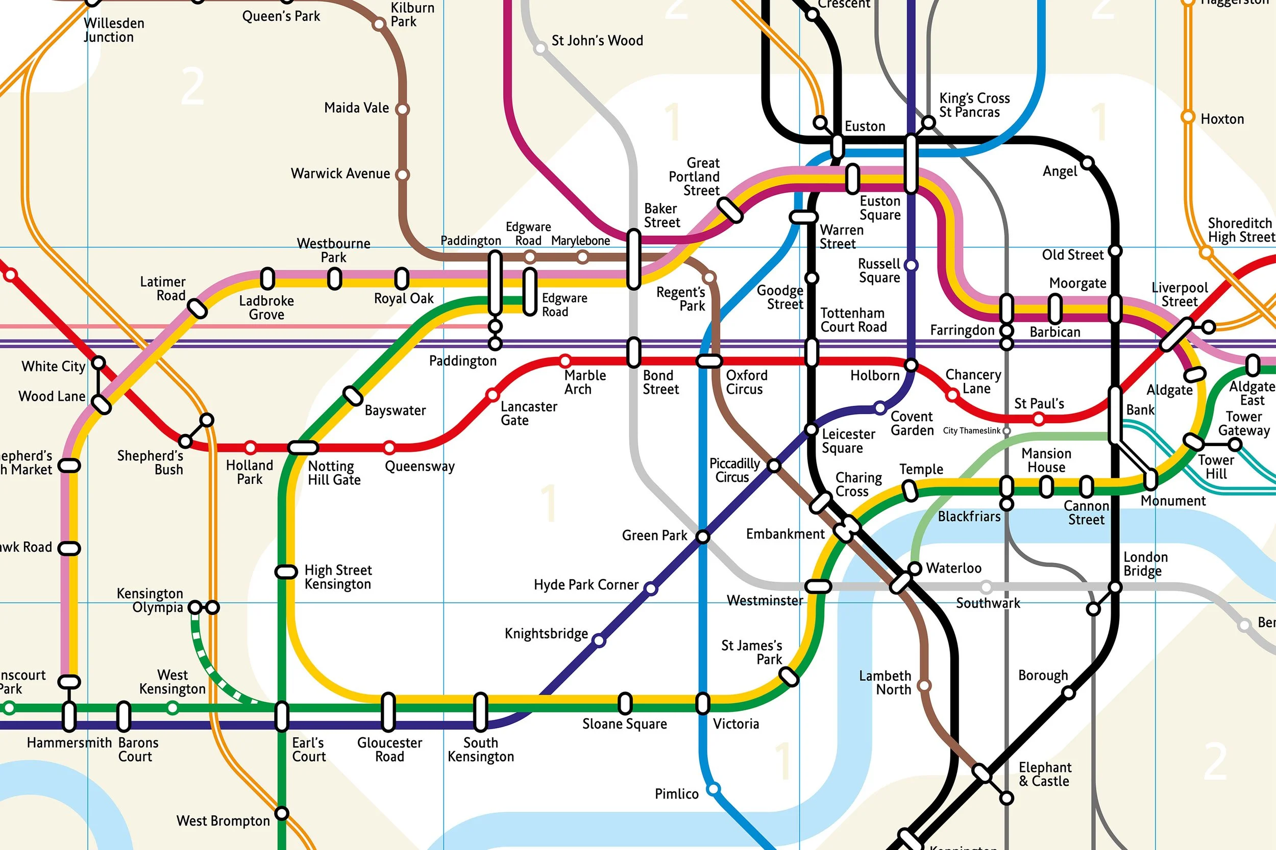
However, friends of mine from outside of London commented that they found the current map hard to use and in particular found the disconnect between the map and London at street level confusing. This sparked my curiosity as a designer, would it be possible to design something as clear as the Beck map but manage to be more geographically accurate? That ‘thought experiment’ eventually expanded to become the complete alternative map of the system I published in 2011.
With the imminent arrival of Crossrail (or the Elizabeth Line as it will be known), I thought it was time to update my map. Looking back at the design I published nearly ten years beforehand, I found I really didn’t like it very much any more. It’s a bit busy, a bit fussy in some places, slightly chaotic in others. One comment on the original was from actor and writer Mark Gatiss who described it as ‘aesthetically frightful’, and revisiting it, I think he has a point.
One of the hardest things to do as a designer is to put an idea to one side and come up with something different but that is what I did. Instead of just adding the new line to the old design, I rebuilt the whole thing from scratch. This time as well as the geographical parameter, I concentrated on making a simpler, more elegant solution adopting the 45º lines of the classic Beck original.
The major difference between when I did my original tubemap and this new one is my involvement with the wider lettering arts community becoming a member of Letter Exchange and working closely with the Lettering Arts Trust. This has been a huge influence on me and I believe has influenced the design of the new version of my map. The fluidity of the line and the precision of the curves, corners and junctions all owe a lot to my experiences drawing and cutting letterforms and typefaces both by hand and on screen.
The version on display in this exhibition [Rock Paper Pixel 2019] is the first published iteration of the new map. It is work in progress and will continue to change and develop as indeed the network it represents will continue to do. I have said all along that this is not intended to replace the standard map based on Beck’s original design, it’s simply another way of looking at it.